If there’s anything good about a two-year contract, it’s the new phone that comes at the end. When time came for my iPhone 5 to enjoy an easy retirement as an MP3 player, it was an opportunity for something new. After all, winding up with something novel and different is half the fun of upgrading.
For years, Windows Phone stood present but not prominent among the bigger smartphone platforms. According to the International Data Corporation, Microsoft’s platform retains a measly 2.8 percent market share, falling far behind bigger brands (though still better than Blackberry).

The Nokia Lumina 635 retails for under $200 and won its way into my heart and hand. It’s far from the flagship my iPhone was, but here’s why that’s not a problem.
It’s no potato
Because of their ubiquity, it’s easy to imagine that devices running iOS and Android are the only “real” smartphones on the market. Like if you go astray, you’ll wind up with some 2006 TracFone made out of LEGOS with voicemail hyped as a top-5 feature.
Without getting bogged down by specs, a user can tell the performance differences between the Lumina and the iPhone. Multi-tasking on the Lumina is not so seamless. The camera and screen are not top of the line. But if you want to store music or load a video, the Lumina has got you. The app store isn’t as populated as bigger platforms, but still offers options. Stream or download music free to your phone or even get a Game Boy – something Apple never allowed. Maps and navigation get you where you need to go. Pre-installed apps carry their weight but can be made scarce if you’re not a fan. Many can even be totally uninstalled.
The Lumina 635 felt like a real smartphone bolted to a desk in the AT&T store and held up once let off the leash.
Windows 8.1 is a solid experience
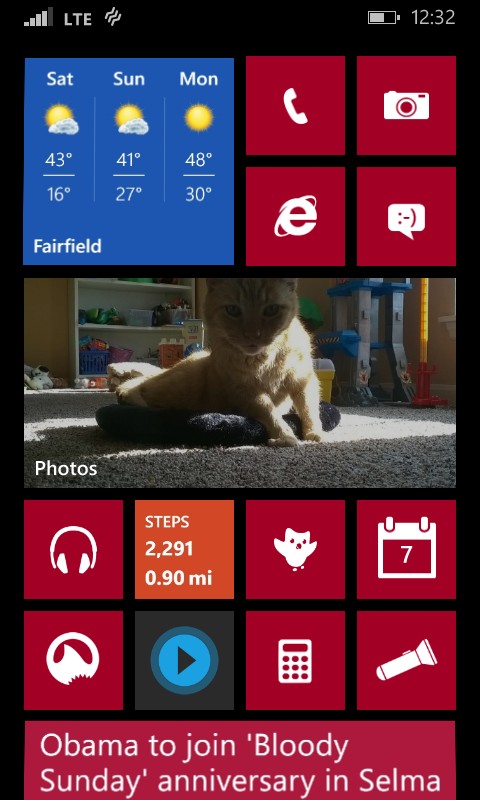
On a primarily aesthetic point, tiles are practical and pretty. The rectangular buttons change size, shape, and color and can be rearranged in any configuration imaginable. Personally, this is preferable to the static, cartoonish icons of my old OS.
Some apps have widgets built into their tiles when displayed at the correct size. For example, the native photo gallery displays a slideshow of your favorite photos. So on my home screen is a cycling album of my best shots, coolest experiences and favorite Internet memes. You’ll know the temperature at a glance if you give the weather app enough space to shine. Even webpages can be linked as a tile on your home for easy, direct access.
All these things combine to create a vibrant and highly personal OS that allows each user’s setup to look and feel quite different. It provides a level of customization that not only enhances the vibe of your setup, but the functionality as well. Which apps and widgets earn a place of predominance? That depends on how you use your phone.
No U2
Honestly, it’s great not having to see Bono’s smug, unsolicited face in between my Sublime collection and the “Various Artists” tag of the Tropic Thunder soundtrack. No special op-out required.
While that isn’t a substantial enough reason to switch phones, it does speak to competing philosophies in the tech industry. How much say should a user get in the functionality of a product they purchased? Is lack of customization a feature if intended to ensure the design team’s vision? These are rhetorical questions without “true” answers.
In the end, all that matters is that you enjoy your phone. After all, it probably needs to last two years – even a lease doesn’t last so long. The iPhone 5 served me well. It was my first smartphone because I wanted Apple’s experience. I switched to Windows Phone because I wanted to create my own.


